The brief
Union is a design study for an Austin handyman service that sells on straight pricing. Its customers are homeowners, renters and small landlords who have a list of jobs and a fear of vague estimates. The site has to make one promise very clear: send the list, get an itemised quote back today, and pay only once the work is signed off. Everything else supports that promise.
The challenge
Many people put off small repairs because they cannot guess the cost. They worry a handyman will quote low, find extra problems and send a bigger bill. Saying 'transparent pricing' on a website does not help much, because every competitor says it. Union needed to show the pricing model working, not just describe it.
The second problem was comparison. Homeowners weighing up a handyman often compare against hiring separate trades or doing the job themselves. A site that ignores those options leaves the visitor to work it out alone, usually on another tab. We wanted the page to make that comparison openly and keep the visitor on the site while they did it.
Our approach
A quote that prints itself
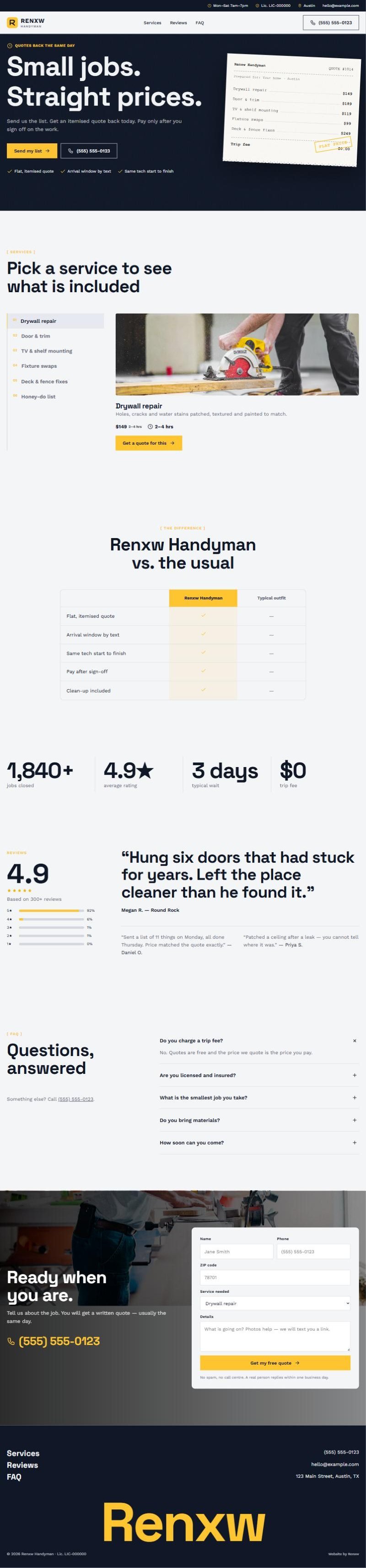
The hero is a receipt-style quote ticket. As the page loads, line items print one after another: hang three shelves, rehang a door, patch drywall, each with a price, then a total at the bottom. It is a small animation, but it shows exactly what a customer will receive. The headline, 'Small jobs. Straight prices.', sits beside it, so the words and the proof land together.
Services, comparison, then proof
Services sit in tabs so a visitor can jump to carpentry, plumbing fixes or assembly without scrolling a long list. A comparison table then sets Union against hiring several trades or a vague hourly quote. Rolling stat counters add scale, a single large review gives one strong customer voice, an FAQ split into heading and questions handles the details, and a closing photo section asks for the list.
Ask for the list, not a call
For this model the main action is 'send us your list'. A short form with a free-text box and an optional photo upload suits people who want a price in writing before they talk to anyone. A phone link stays in the header for urgent jobs. The pay-after-sign-off promise appears beside every quote button, because it removes the last reason to wait.
Crisp type and a yellow pen
Union uses a cool off-white (#f4f5f7), a deep navy (#101828) and a highlighter yellow (#ffc531) that marks prices and buttons like a pen on paper. Space Grotesk gives headings a precise, technical tone that suits itemised pricing, while Work Sans keeps longer text readable. On phones the receipt shortens to four lines and the comparison table turns into stacked cards, so nothing needs sideways scrolling.
What we built
- Services in tabs grouped by type of job
- Comparison table against separate trades and hourly quotes
- Rolling stat counters for jobs and response times
- One large featured review given the full width
- FAQ split with heading on one side, questions on the other
- Closing call to action over a full-width job photo
The takeaway
Union shows that a handyman site can sell the pricing model itself. If your edge is clear, itemised quotes, put a real example of one at the top and compare yourself openly with the alternatives. RENXW can design and build a handyman website around your own quoting process, with the forms wired straight into your inbox or CRM.
The full page
Scroll inside the frame to read the homepage from hero to footer.